Building Basic Layouts in Jetpack Compose (Column, Row, and Box)
Hello folks! In this article, I will discuss the basics of compiling layouts with compose. Compose is a declarative UI framework, so in building layouts, the things that must be know are Kotlin and the declarative paradigm, this is different from the previous method when using xml with an imperative paradigm. You can check the article Introduction to Jetpack Compose to better understand the difference between the declarative and imperative paradigms.
Using a declarative paradigm makes the UI building process easier and faster, because it is enough to describe the desired appearance in a Composable Function which is written like a normal function and Compose will handle it behind the scenes. To make it easier to understand this concept, just imagine that a Composable Function is a set of code blocks for building an application. So when building the UI for an application, we have to think like playing building blocks by putting together each part of the block to get the desired shape.
There are three components that can be used to create layout with compose:
- Column, used to arrange widget elements vertically
- Row, used to arrange widget elements horizontally
- Box, used to arrange objects in layers(overlaps)
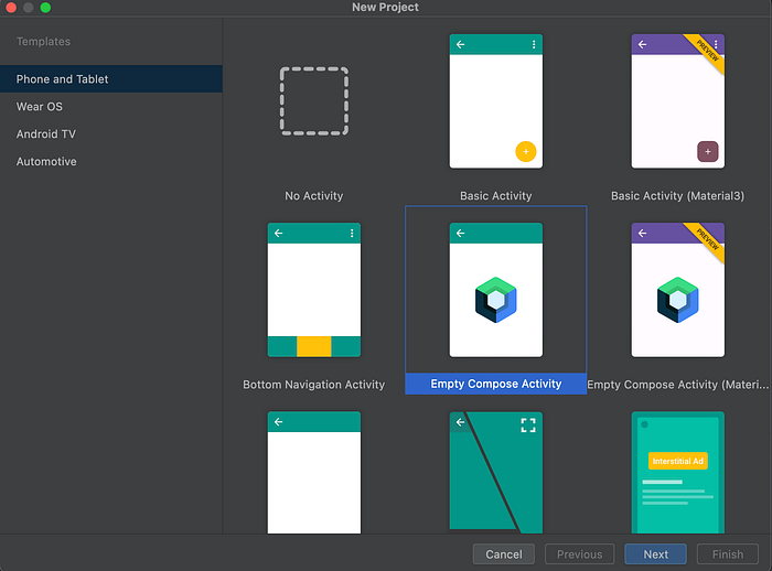
To understand more about each component, let’s just practice it. Please create a project using Compose Activity.
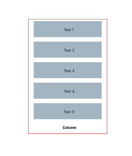
When using Column each child will be arranged vertically. As an example let’s make the illustration below. There are five text as part of the column children.
Then the code will be written as follows:
1. Create a Composable Function with the comp shortcut and write the name of the function to be used.
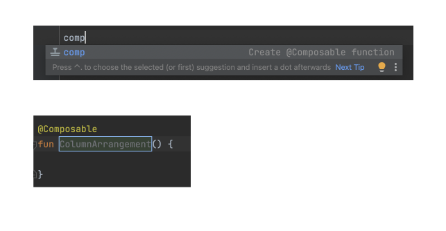
2. Then add code Column and five Text as children elements.
@Composable
fun ColumnArrange() {
    Column() {
        Text(text = "Column1")
        Text(text = "Column2")
        Text(text = "Column3")
        Text(text = "Column4")
        Text(text = "Column5")
    }
}
3. Then call the Column Arrange function as setContent, as shown below.
class MainActivity : ComponentActivity() {
    override fun onCreate(savedInstanceState: Bundle?) {
        super.onCreate(savedInstanceState)
        setContent {
            PlayingWithComposeTheme{
                Surface {
                    ColumnArrange()
                }
            }
        }
    }
}
4. So the complete code will be as below.
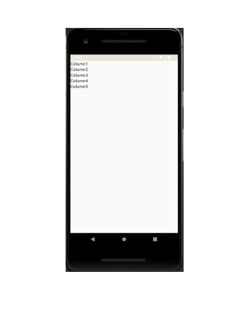
5. When compiled it will be like below. You can visit this Github Repository, and select the arrange-column branch.
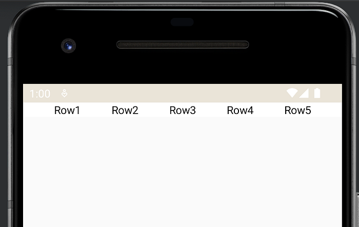
Whereas when using Row each child will be arranged horizontally. As an example, let’s create the illustration below. There are five text as part of Row Children.

And the code will be written as follows:
1. Create a composable function with the same steps as before with the name RowArrange.
2. Add code Row and five Text as children elements.
@Composable
fun RowArrange(modifier: Modifier) {
    Row(modifier = modifier.fillMaxWidth(), horizontalArrangement = Arrangement.SpaceEvenly) {
        Text(text = "Row1")
        Text(text = "Row2")
        Text(text = "Row3")
        Text(text = "Row4")
        Text(text = "Row5")
    }
}
3. Then call on setContent and the code will be like below.
4. And if compiled it will be as follows, you can visit this Github Repository, and select branch row-arrange.
When using Box each child will be stacked. To make it clearer, consider the code below.
fun BoxArrange(modifier: Modifier) {
    Box(
        modifier = modifier
            .fillMaxHeight()
            .fillMaxWidth(), contentAlignment = Alignment.Center
    ) {
        Text(text = "Box 1")
        Text(text = "Column 1")
        Text(text = "Row 1")
        Text(text = "Box 2")
        Text(text = "Column 2")
    }
}
Then call BoxArrange on setContent and compile it, the result will look like below, you can visit this Github Repository and select the box-arrange branch.

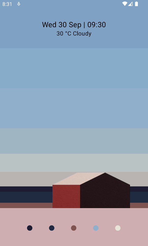
The explanation above is just an introduction, now let’s try to build a simple layout using the 3 components described above. The following is the expectation layout that will be built. This reference I got from https://pin.it/vXXfCdQ.
To make it easier to arrange the layout, consider the image below.
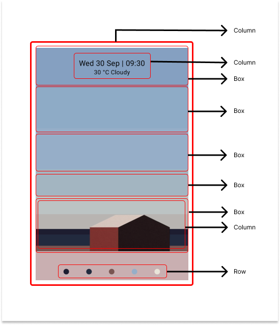
Next, Look at the following steps below:
1. Add some color to the color.kt file
val Blue7EA1C4 = Color(0XFF7EA1C4)
val Blue87ACC9 = Color(0XFF87ACC9)
val Blue90AFCB = Color(0XFF90AFCB)
val Blue9EB6C2 = Color(0XFF9EB6C2)
val YellowBAC3C3 = Color(0XFFBAC3C3)
val YellowB9B4B0 = Color(0XFFB9B4B0)
val Black1D1D32 = Color(0XFF1D1D32)
val Black202A40 = Color(0XFF202A40)
val Orange805350 = Color(0XFF805350)
val PinkCEAEB1 = Color(0XFFCEAEB1)
2. Create a composable function with the name Wallpaper and the parameter modifier as shown below. Next add a Column component with some attributes.
- Modifiers tell UI elements how to arrange, display, or behave in the parent layout. In addition, modifiers are able to decorate or add behavior to UI elements.
- fillMaxWidth, sets the max width similar to match_parent in xml.
- fillMaxHeight, sets the max height similar to match_parent in xml.
- background, set the screen background color
@Composable
fun Wallpaper(modifier: Modifier) {
    Column(
        modifier = modifier
            .fillMaxWidth()
            .background(color = PinkCEAEB1)
            .fillMaxHeight()
    ) {

    }
}
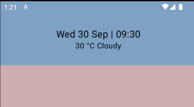
3. Continue to add the code as below, to add text time to the wallpaper display.
Column(
        modifier = modifier
            .fillMaxWidth()
            .background(color = PinkCEAEB1)
            .fillMaxHeight()
    ) {
        Box(
            modifier = modifier
                .fillMaxWidth()
                .height(110.dp)
                .background(color = Blue7EA1C4), contentAlignment = Alignment.Center
        ) {
            Column(horizontalAlignment = Alignment.CenterHorizontally) {
                Text(text = "Wed 30 Sep | 09:30", fontSize = 20.sp, textAlign = TextAlign.Center)
                Text(text = "30 °C Cloudy", textAlign = TextAlign.Center)
            }
        }
    }
}
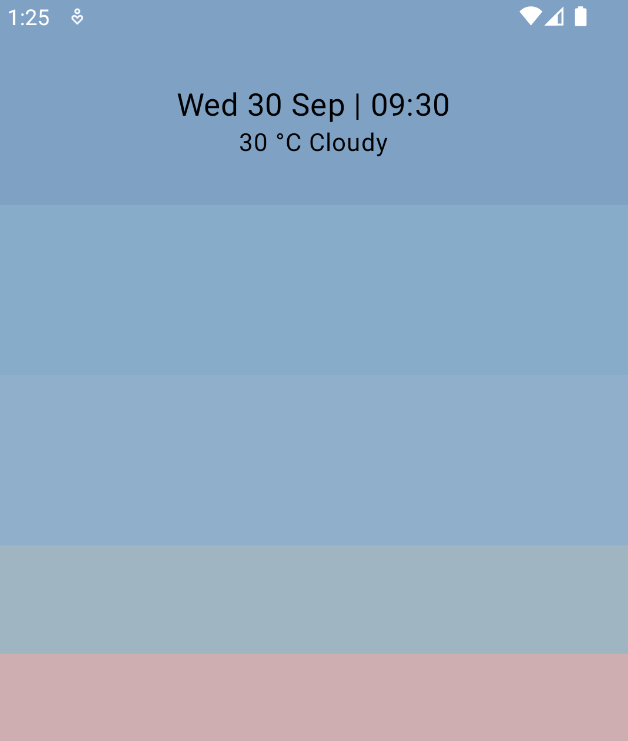
4. Add several boxes with color variations and add them under the box time code on the wallpaper as below.
Box(
    modifier = modifier
        .fillMaxWidth()
        .height(110.dp)
        .background(color = Blue87ACC9)
)
Box(
    modifier = modifier
        .fillMaxWidth()
        .height(110.dp)
        .background(color = Blue90AFCB)
)
Box(
    modifier = modifier
        .fillMaxWidth()
        .height(70.dp)
        .background(color = Blue9EB6C2)
)
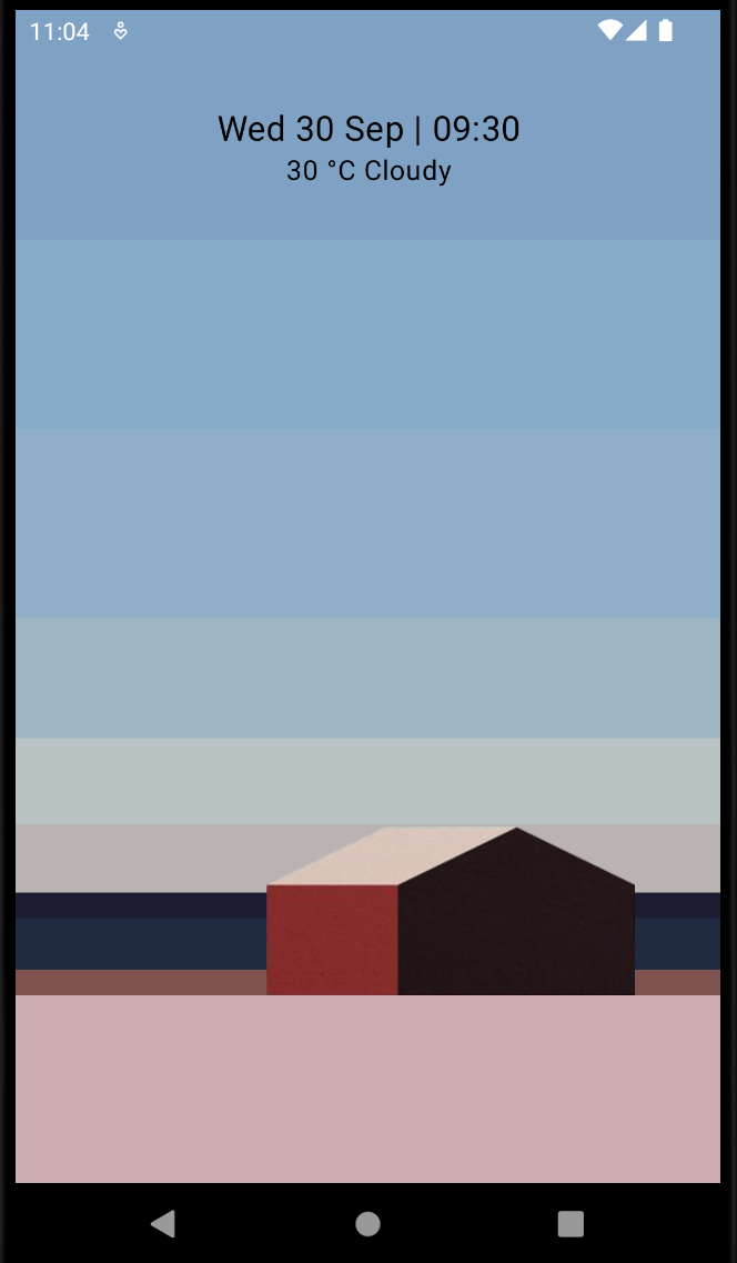
5. There is a building image on the wallpaper display, download the image assets on the following link. Next add the image in the drawable directory. If you pay close attention, the image of the building is on the top layer, so you need a Box as a container, then the bottom component is filled with all columns and an image is added on top. The code will be like below.
Box(contentAlignment = Alignment.BottomEnd) {
    Column() {
        Box(
            modifier = modifier
                .fillMaxWidth()
                .height(50.dp)
                .background(color = YellowBAC3C3)
        )
        Box(
            modifier = modifier
                .fillMaxWidth()
                .height(40.dp)
                .background(color = YellowB9B4B0)
        )
        Box(
            modifier = modifier
                .fillMaxWidth()
                .height(15.dp)
                .background(color = Black1D1D32)
        )
        Box(
            modifier = modifier
                .fillMaxWidth()
                .height(30.dp)
                .background(color = Black202A40)
        )
        Box(
            modifier = modifier
                .fillMaxWidth()
                .height(15.dp)
                .background(color = Orange805350)
        )
    }
    Image(
        painter = painterResource(id = R.drawable.house),
        contentDescription = null,
        alignment = Alignment.CenterEnd,
        modifier = modifier
            .padding(end = 50.dp)
            .width(215.dp),
        contentScale = ContentScale.FillWidth
    )
}
When compiled it will be like this:
6. In the last part of the Wallpaper UI, at the bottom of this UI there is a circle color palette that is arranged horizontally. So Row can be used for this case. Apart from that, the circles displayed are the same size, the difference is only in the color of each circle. Creating a separate funtion for circles with a color parameter would certainly make compiling this component easier.
7. Create a composable function with the name CircleColor and add a parameter in the form of color. Then use the canvas to create a circle object. So the code will be like this:
@Composable
fun CircleColor(modifier: Modifier, color: Color) {
    Canvas(modifier = modifier.size(15.dp), onDraw = {
        drawCircle(color = color)
    })
}
8. The final step is to add a Row to the main Column, then call the CircleColor function as many circles as you want and add values for the modifier and color parameters. Then the code will be like the following:
Row(
    modifier = modifier
        .fillMaxWidth()
        .fillMaxHeight().padding(start = 30.dp, end = 30.dp),
    verticalAlignment = Alignment.CenterVertically,
    horizontalArrangement = Arrangement.SpaceEvenly
) {
    CircleColor(modifier = modifier, color = Black1D1D32)
    CircleColor(modifier = modifier, color = Black202A40)
    CircleColor(modifier = modifier, color = Orange805350)
    CircleColor(modifier = modifier, color = Blue90AFCB)
    CircleColor(modifier = modifier, color = DarkCream)
}
So the whole code will be like below.
When compiled, the UI will look like the one below. You can access all the code in this Repository and select the wallpaper-app branch.

That’s all for the article about the basics of building layouts in Jetpack Compose. Don’t forget to follow and👏🏻 for this article because it means a lot to me to be more enthusiastic about writing the next content — :). See you in the next article.
