Explore Constraint Layout on Jetpack Compose

Hello folks, ConstraintLayout has long been a solution for developers to build a complex layout by avoiding display hierarchies and complicated positioning that sometimes have an impact on app performance. ConstraintLayout simplifies the creation of complex layouts in android applications. Besides that, android studio support, makes it possible to build most UI’s using only a visual editor with the drag and drop method. So in my personal opinion it is very difficult to leave this God of Layout.
So it was very encouraging for android developers when it was announced that ConstraintLayout could be implemented in compose. In this article I will discuss the implementation of a ConstraintLayout on a UI built using compose.
As far as I know, there are 2 methods that can be used in implementing Constraint Layout. I will try to explain both in this article. But the first thing to do after creating a project is to add the constraint layout library to the dependencies file and then sync the gradle file.
implementation "androidx.constraintlayout:constraintlayout-compose:1.0.1"Next, create a composable function with the name ConstraintScreen. Then call this function on the MainActivity class and don’t forget to create a preview of this function. The code will look like below.
class MainActivity : ComponentActivity() {
    override fun onCreate(savedInstanceState: Bundle?) {
        super.onCreate(savedInstanceState)
        setContent {
            PlayingWithComposeTheme {
                Surface {
                    ConstraintScreen()
                }
            }
        }
    }
}

@Composable
fun ConstraintScreen() {

}

@Preview
@Composable
fun PreviewConstraintScreen() {

}
Create a variable that has a value as ConstraintSet which is a class used to define sets of constraints programatically. This class allows to create and store constraints, and apply them to the ConstraintLayout. Create the code as below.
val constraint = ConstraintSet {
    val firstRect = createRefFor("firstRect")

    constrain(firstRect) {
        top.linkTo(parent.top)
        start.linkTo(parent.start)
        end.linkTo(parent.end)
        width = Dimension.fillToConstraints
        height = Dimension.value(100.dp)
    }
}
When setting the position of a view using xml, the following source code is used:
app:layout_constraintTop_toTopOf=”parent” app:layout_constraintStart_toStartOf=”parent”
app:layout_constraintEnd_toEndOf=”parent”
app:layout_constraintBottom_toBottomOf=”parent”
Using compose, positioning the widget as above is done using linkTo.
- start.linkTo(parent.start), makes the firstRect widget anchor the start section on parent(screen).
- top.linkTo(parent.top), makes the firstRect widget anchor the top section on the parent(screen).
- end.linkTo(parent.end), makes the firstRect widget anchor the end to the parent(screen).
When using layout constraints to set the dimensions of the view to fill the remaining space on the screen, 0dp is often used. This can also be implemented in compose but with different code, namely Dimension.fillToConstraints which has the same function as 0dp. Then to calculate the size of the widget dimensions in the constraint can also use Dimension.value(100.dp). In addition, there are also several other components that can be used to set the size of Dimension.wrapContent dimensions for wrap content and Dimension.matchParent for match content.
- width = Dimension.fillToConstraints, sets the width of the firstRect widget to fit the width of the screen.
- height = Dimension.value(100.dp), sets the height of the firstRect widget to 100 dp.
Next, call ConstraintLayout and create a Box by declaring it’s ID as the firstRect widget. For more details, see the code below.
ConstraintLayout(constraintSet = constraint, modifier = Modifier.fillMaxSize()) {
    Box(modifier = Modifier
        .background(DarkGreen)
        .layoutId("firstRect"))

}
And if compiled, it will produce the display as below.

Add a box to the right of secondRect and make the width of the two boxes divided into two equal parts. We can do the same steps as above.
- Add variables to the constraintSet as below
val thirdRect = createRefFor("thirdRect")2. Add constraint details to the thirdRect variable as below. The start of the thirdRect is to the right/end of the secondRect, besides that add 1f for the width of the third so that the two boxes are divided into two even parts.
constrain(thirdRect) {
    top.linkTo(firstRect.bottom)
    start.linkTo(secondRect.end)
    end.linkTo(parent.end)
    width = Dimension.percent(1f)
    height = Dimension.value(100.dp)
}
3. Then create a box as the component of the thirdRect id, as below.
Box(
    modifier = Modifier
        .layoutId("thirdRect")
        .background(YellowPickerColor)
)
One of the features offered by constraint layout is chain. Chains are widgets that are connected to each other with bidirectional positional constraints. This feature can be implemented when using compose with three styles.
- Spread, makes the widgets evenly distributed.
- SpreadInside, makes the start and end widgets affixed to the boundaries at each end of the chain and the rest evenly distributed.
- Packed, makes the widgets stacked together (after margins are taken into account). It also allows us to adjust the bias of the entire chain (left/right or up/down) by changing the display bias of the head chain.
For more details, see the code below:
1. Add two variables to the constraintSet as fourthRect and fifthRect, as below.
val fourthRect = createRefFor("fourthRect")
val fifthRect = createRefFor("fifthRect")
2. Next set the constraint position of the two variables above, as below.
constrain(fourthRect) {
    top.linkTo(secondRect.bottom)
    start.linkTo(parent.start)
    width = Dimension.value(100.dp)
    height = Dimension.value(100.dp)
}
constrain(fifthRect) {
    top.linkTo(secondRect.bottom)
    start.linkTo(fourthRect.end)
    end.linkTo(parent.end)
    width = Dimension.value(100.dp)
    height = Dimension.value(100.dp)
}
3. Then create a box as the id of the fourthRect and fifthRect, as below.
Box(
    modifier = Modifier
        .layoutId("fourthRect")
        .background(GreenPickerColor)
)
Box(
    modifier = Modifier
        .layoutId("fifthRect")
        .background(Purple40)
)
4. Then create a chain for the two widgets above, because both widgets are arranged horizontally, use createHorizontalChain() if the widgets are arranged vertically then use createVerticalChain(), note the code below.
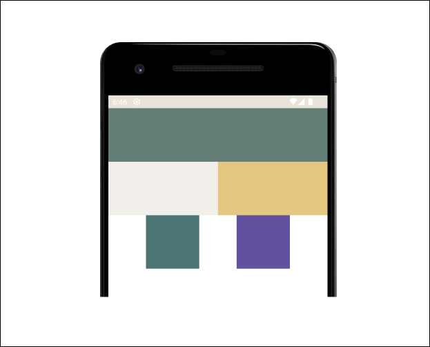
createHorizontalChain(fourthRect, fifthRect, chainStyle = ChainStyle.Spread)The code above implements one of Chain’s styles, spread, so if compiled it will look like this.

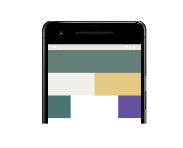
Next, try replacing ChainStyle with SpreadInside as below.
createHorizontalChain(fourthRect, fifthRect, chainStyle = ChainStyle.SpreadInside)
Finally, try replacing ChainStyle with Packed, as below.
createHorizontalChain(fourthRect, fifthRect, chainStyle = ChainStyle.Packed)
Besides Chain there is one other feature that is the attraction of Constraint Layout, namely Guideline, this feature can also be implemented in compose. Guideline is a class that contains helper objects in ConstraintLayout. This helper object is not displayed/visible on the device and is only used to help organize the layout. There are two types of guideline that can be implemented.
- VerticalGuideline, has zero width and height of the parent ConstraintLayout.
- HorizontalGuideline, has zero height and width of the ConstraintLayout parent.
Let’s try to implement the guideline on a page that has previously added several widget boxes.
1. Add sixRect and sevenRect variables to the ConstraintSet as below.
val sixRect = createRefFor("sixRect")
   val sevenRect = createRefFor("sevenRect")
2. Then add a guideline variable with a value of create guideline, as below.
val guideline = createGuidelineFromBottom(0.1f)3. Next add the constraint details of the sixRect and sevenRect variables, make the guideline an object that binds the two widgets from the bottom, as below.
constrain(sixRect) {
    bottom.linkTo(guideline)
    start.linkTo(parent.start)
    width = Dimension.value(100.dp)
    height = Dimension.value(100.dp)
}
constrain(sevenRect) {
    bottom.linkTo(guideline)
    start.linkTo(sixRect.end)
    end.linkTo(parent.end)
    width = Dimension.value(100.dp)
    height = Dimension.value(100.dp)
}
4. Next, create a box as the widget of the two IDs above.
Box(
    modifier = Modifier
        .layoutId("sixRect")
        .background(Pink40)
)
Box(
    modifier = Modifier
        .layoutId("sevenRect")
        .background(NeonGreen)
)
5. Then to improve the understanding of Chain, implement Chain in both widgets as below.
createHorizontalChain(sixRect, sevenRect, chainStyle = ChainStyle.Spread)So the whole code will be as below.
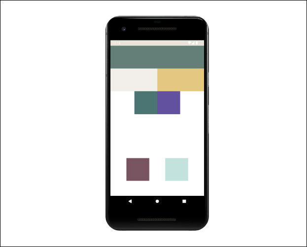
And when compiled it will produce a display as below. For code details, see the following github repository and select the basic-constraint branch.

Implementing Constraint Layout in compose is quite easy if you already understand Constraint Layout in view. To improve our ability to use Constraint Layout, let’s try implementing Constraint to build a UI view, below.

In this part I will try to use createRefs() in building the above layout using Constraint Layout. createRefs() is a function that creates a ConstraintRef object. This ConstraintRef object is used to reference the views that will be constrained in the layout.
But first create a package with the name widget and add a kotlin file with the name WidgetCustom. Add some custom widgets that will be used to build the layout above, with the code below.
@Composable
fun CircleBackground(modifier: Modifier, colors: Color, size: Int) {
    Canvas(modifier = modifier.size(size.dp), onDraw = {
        drawCircle(color = colors)
    })
}

@Composable
fun ImageRounded(modifier: Modifier, image: Int) {
    Image(
        painter = painterResource(id = image), contentDescription = null, modifier = modifier
            .clip(
                RoundedCornerShape(20)
            )
            .width(80.dp)
            .height(80.dp), contentScale = ContentScale.Crop
    )
}

@Composable
fun ImageCircle(modifier: Modifier, image: Int) {
    Image(
        painter = painterResource(id = image), contentDescription = null, modifier = modifier
            .clip(CircleShape)
            .width(70.dp)
            .height(70.dp), contentScale = ContentScale.Crop
    )
}
Next, create a Composable function with the name HomeScreen and add a Layout Constraint inside the function as below.
class MainActivity : ComponentActivity() {
    override fun onCreate(savedInstanceState: Bundle?) {
        super.onCreate(savedInstanceState)
        setContent {
            PlayingWithComposeTheme {
                Surface {
                    HomeScreen(Modifier)
                }
            }
        }
    }
}

@Composable
fun HomeScreen(modifier: Modifier) {
    ConstraintLayout(
        modifier = Modifier
            .background(color = GreenLightBackground)
            .fillMaxSize()
    ) {

    }
}
To make it look as similar as possible to the reference above, use some of the colors below.
val Purple80 = Color(0xFFD0BCFF)
val PurpleGrey80 = Color(0xFFCCC2DC)
val Pink80 = Color(0xFFEFB8C8)

val Purple40 = Color(0xFF6650a4)
val PurpleGrey40 = Color(0xFF625b71)
val Pink40 = Color(0xFF7D5260)

val GreenLightBackground = Color(0xFF2D635A)
val GreenDarkBackground = Color(0xFF25544C)
val OrangePickerColor = Color(0xFFFFA500)
In addition to colors there are several image assets that can be downloaded at the following link, and add them to the drawable directory.
Next, add a variable that will represent the ID of each widget with the value createRefs(). The maximum number of variables that can be added is 16, so the code will be like below.
val (circleFirst, circleSecond, whiteBackground, topLine, drawerIcon, title, bottomLine, firstSpacer, firstImage, secondImage, thirdImage, itemFirstTitle, itemFirstDesc, itemSecondTitle, itemSecondDesc, itemThirdTitle) = createRefs()
val (itemThirdDesc, authorTitle, firstAuthorImage, firstAuthorName, secondAuthorImage, secondAuthorName, thirdAuthorImage, thirdAuthorName) = createRefs()
And the whole code, as below.
And when compiled, it will produce the display as below.

For project details you can visit the following github repo, then select the handpicked-app branch.
That’s all for this series, hopefully useful and see you in the next series!!! Don’t forget to follow and👏🏻 for this article because it means a lot to me to be more enthusiastic about writing the next content — :).
